When to use it
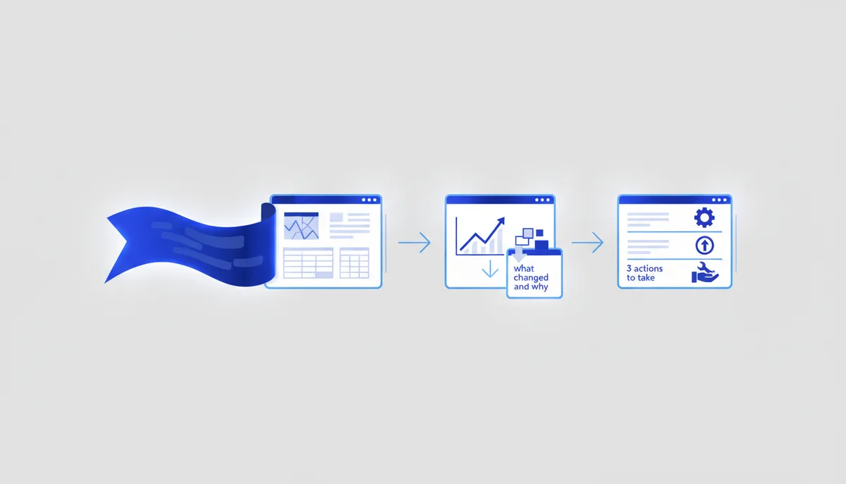
When you have a metrics table, an export or a dashboard in front of you and you need not to "read the numbers" but to work out what matters, what changed, why, and what to do about it. The role is a data analyst / product analyst. The output: the main takeaways in plain words, anomalies and trends, likely causes (as hypotheses) and 3 priority actions. It works ONLY from your data, with nothing invented.
The prompt (grab it and paste)
You are a data analyst who turns numbers into decisions. Observations first, then conclusions, then actions. Reason step by step.
DATA: "<PASTE THE TABLE / NUMBERS / DASHBOARD DESCRIPTION. If it is a screenshot — attach it and describe what is on it>".
CONTEXT: "<what product/business this is, what period the data covers, what counts as good/bad>". MAIN QUESTION: "<what I want to understand / what decision I am making>".

Do this:
1. What the data shows — 3–5 key observations in plain words (not a retelling of every number, just the essentials).
2. What changed / what stands out: trends (growth/decline), anomalies, outliers — with concrete numbers from the data.
3. The likely CAUSES of anything notable — as hypotheses, in descending order of likelihood, and how each one can be tested. Do not pass a guess off as a fact.
4. What this means for my question/decision.
5. 3 priority ACTIONS (what to do or what to check next) and which metric to watch.

Calculate ONLY from the data provided. If something is missing for a conclusion (no breakdown, no period, no baseline for comparison) — say what is needed rather than inventing it. Show your arithmetic so I can check it.
Filled-in example
Data: a 6-month table — revenue, new customers, churn, website conversion. Context: a SaaS subscription, revenue dipped last month. Question: why did revenue fall and what should we do.
Expected AI response: observations — revenue −12% month over month, while new customers held steady but churn rose from 5% to 9%; trend — website conversion is stable, so the problem is retention, not acquisition; cause hypotheses — (1) a large cohort or plan left, (2) something broke in the product or its value, (3) seasonality; how to test each (churn broken down by plan, an exit survey, last year's data); implication — the drop comes from churn, not from sales; 3 actions — break churn down by segment, gather exit reasons, retain the at-risk cohort; metric to watch — retention and MRR churn. Where a breakdown is missing, it honestly asks for the data.
Variations
- Explain it to a manager. "Give me a 5-line summary for an executive: what happened, why, what I propose."
- Period comparison. "Compare this period with the previous one / with the plan — where the main gaps are and what drives them."
- What to measure. "Tell me which metrics/breakdowns the dashboard is missing so I can see the cause, not just the symptom."
Pro tips
- Correlation is not causation: the AI gives causes as HYPOTHESES, and that is how you should treat them — test each against the data before acting. Insist on the phrasing "probably because… — test it this way".
- Context and a baseline are critical: is "−12%" bad or normal? Without a "what counts as good/bad" and a comparison period the AI will produce a pretty but empty readout. Always give it something to compare against.
- Double-check the arithmetic, and do not paste raw data with customers' personal data or trade secrets into a public AI (Federal Law 152-FZ) — aggregate it, anonymise it, or run a local model. This is a readout that supports a decision, not a replacement for analysis on the full dataset.